block vs inline
block element
- 화면 전체를 사용하는 태그
1
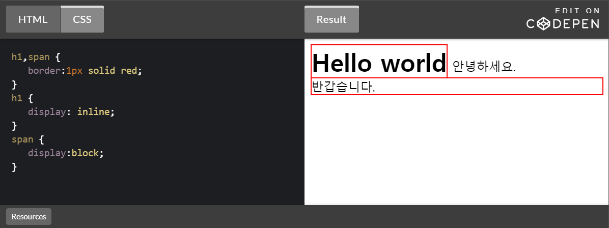
<h1>Hello world</h1>
inline element
- 화면의 일부를 차지하는 태그
1
<span>반갑습니다.</span>
block vs inline
1
2
<h1>Hello world</h1>
안녕하세요. <span>반갑습니다.</span>

display
display 속성을 사용해서 block element 를 inline element 로 바꿀수 있고, inline element를 block element 로 바꿀수 있다.
html
1
2
<h1>Hello world</h1>
안녕하세요. <span>반갑습니다.</span>
css
1
2
3
4
5
6
7
8
9
h1,span {
   border:1px solid red;
}
h1 {
   display: inline;
}
span {
   display:block;
}
박스 모델(box model)
사각형의 형태(box)로 그 태그의 부피감을 결정한다
박스모델 관련 속성들
- margin : 태그와 태그 사이의 여백.
- padding : 태그와 내부 컨텐츠 사이의 여백
- border: width style color; 순서로 값 지정
inline element는 width, height 값이 무시 된다.
box-sizing
- 박스의 크기를 화면에 표시하는 방식을 변경하는 속성.
- width와 height는 엘리먼트의 컨텐츠의 크기를 지정한다.
- content를 기준으로 하기 때문에 테두리가 있는 경우에는 테두리의 두께로 인해서 원하는 크기를 찾기가 어렵다.
box-sizing:border-box; 로 지정하면 테두리를 포함한 크기를 지정할 수 있기 때문에 예측하기가 더 쉽다.
html
1
2
<div id="small">Hello</div>
<div id="large">Hello</div>
css
1
2
3
4
5
6
7
8
9
10
11
12
div {
    margin:10px;
    width:150px;
}

#small {
    border:10px solid black;
}

#large{
    border:30px solid black;
}

css * { box-sizing:border-box; }
1
2
3
4
5
6
7
8
9
10
11
12
13
14
15
16
17
* {
     box-sizing:border-box;
 }

div {
    margin:10px;
    width:150px;
}

#small {
    border:10px solid black;
}

#large{
    border:30px solid black;
}

position
엘리먼트의 위치를 지정하는 4가지 방법
- static
- relative
- absolute
- fixed
static VS relative
position: static
기본값으로 position 값을 지정하지 않을경우 static이 기본값으로 들어간다.
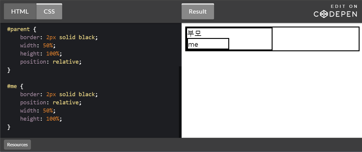
position: relative
position 속성의 값을 relative로 할 경우 부모 태그를 기준으로 ‘position’ 을 잡는다.
html
1
2
3
4
5
6
7
8
    <div id='container'>
        <div id='parent'>
          부모
          <div id='me'>
            me
          </div>
        </div>
    </div>
css
1
2
3
4
5
6
7
8
9
10
11
12
13
14
15
16
17
18
19
20
21
* {
    box-sizing: border-box;
}

#container {
    border: 2px solid black;
}

#parent {
    border: 2px solid black;
    width: 50%;
    height: 100%;
    position: relative;
}

#me {
    border: 2px solid black;
    position: relative;
    width: 50%;
    height: 100%;
}
absolute
부모태크를 무시하고 body태그 기준으로 위치를 잡는다. 부모태그중 positon의 값이 static 아닌경우 부모태그를 기준으로 위치를 잡는다.
html
1
2
3
4
5
6
7
8
    <div id='container'>
        <div id='parent'>
          부모
          <div id='me'>
            me
          </div>
        </div>
    </div>
css
1
2
3
4
5
6
7
8
9
10
11
12
13
14
15
16
17
18
19
20
* {
    box-sizing: border-box;
}

#container {
    border: 2px solid black;
}

#parent {
    border: 2px solid black;
}

#me {
    background-color: black;
    color: white;
    border: 2px solid black;
    position: absolute;
    left:0;
    top:0;
}
부모태그에 position 값이 없을때

부모태그에 position 값이 있을때

fixed
부모태그를 무시하고 스크롤을 내려도 지정된 위치에 있는다.
html
1
2
3
4
5
6
7
8
    <div id='container'>
        <div id='parent'>
          부모
          <div id='me'>
            me
          </div>
        </div>
    </div>
css
1
2
3
4
5
6
7
8
9
10
11
12
13
14
15
16
17
18
19
20
21
* {
    box-sizing: border-box;
}

#container {
    border: 2px solid black;
}

#parent {
    border: 2px solid black;
    position: relative;
}

#me {
    background-color: black;
    color: white;
    border: 2px solid black;
    position: fixed;
    left:0;
    top:0;
}

flex
flex를 사용하기 위해서는 컨테이너 태그에 display:flex 속성을 부여한다. flex-direction을 이용해서 정렬방향을 바꿀 수 있다. flex-directiondms 기본적으로 row 라는 기본값을 갖게 된다.

display: flex flex-directiondms: row
flex-directiondms 기본적으로 row 라는 기본값을 갖게 되고 수평방향으로 정렬된다.
html
1
2
3
4
5
6
7
    <div class="container">
        <div class="item">1</div>
        <div class="item">2</div>
        <div class="item">3</div>
        <div class="item">4</div>
        <div class="item">5</div>
    </div>
css
1
2
3
4
5
6
7
8
9
10
11
        .container {
            background-color: powderblue;
            height:200px;
            display:flex;
            flex-direction:row;
        }
        .item {
            background-color: tomato;
            color:white;
            border:1px solid white;
        }

flex-direction:row-reverse;
row 반대로 정렬된다.
css
1
2
3
4
5
6
7
8
9
10
11
        .container {
            background-color: powderblue;
            height:200px;
            display:flex;
            flex-direction:row-reverse;
        }
        .item {
            background-color: tomato;
            color:white;
            border:1px solid white;
        }

flex-direction:column;
수직방향으로 정렬된다.
css
1
2
3
4
5
6
7
8
9
10
11
        .container {
            background-color: powderblue;
            height:200px;
            display:flex;
            flex-direction:column;
        }
        .item {
            background-color: tomato;
            color:white;
            border:1px solid white;
        }

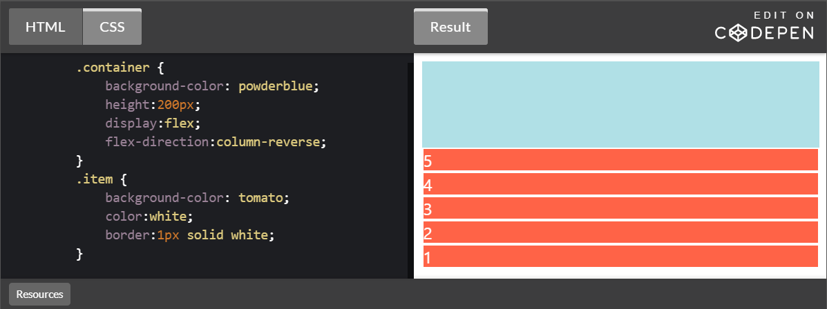
flex-direction:column-reverse
column 반대로 정렬된다.
css
1
2
3
4
5
6
7
8
9
10
11
        .container {
            background-color: powderblue;
            height:200px;
            display:flex;
            flex-direction:column-reverse;
        }
        .item {
            background-color: tomato;
            color:white;
            border:1px solid white;
        }
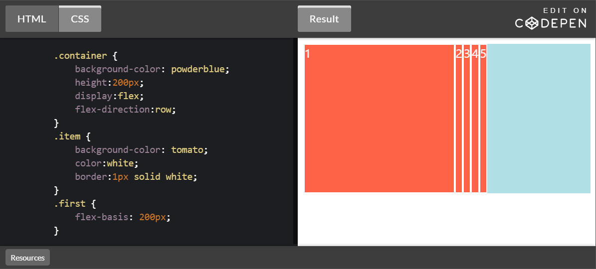
flex-basis
flex 방향에 해당되는 엘리먼트의 크기를 지정한다.
html
1
2
3
4
5
6
7
    <div class="container">
        <div class="item first">1</div>
        <div class="item">2</div>
        <div class="item">3</div>
        <div class="item">4</div>
        <div class="item">5</div>
    </div>
css
1
2
3
4
5
6
7
8
9
10
11
12
13
14
        .container {
            background-color: powderblue;
            height:200px;
            display:flex;
            flex-direction:row;
        }
        .item {
            background-color: tomato;
            color:white;
            border:1px solid white;
        }
        .first {
            flex-basis: 200px;
        }
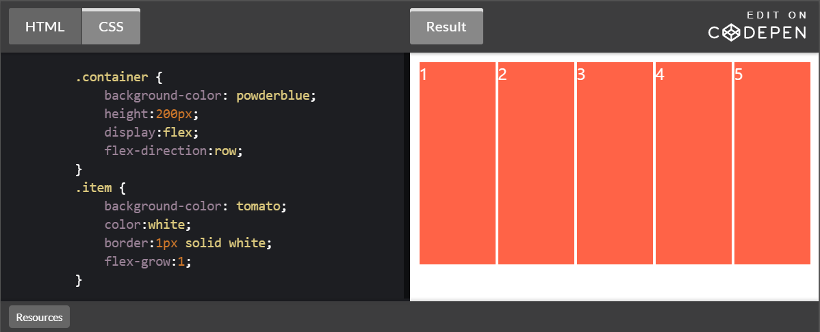
flex-grow & shrink
flex-grow
flex-grow의 기본값은 0이다. flex-grow에 값을 주면 element 들이 여백 전체를 n/1로 나눠 갖는다.
css
1
2
3
4
5
6
7
8
9
10
11
12
        .container {
            background-color: powderblue;
            height:200px;
            display:flex;
            flex-direction:row;
        }
        .item {
            background-color: tomato;
            color:white;
            border:1px solid white;
            flex-grow:1;
        }
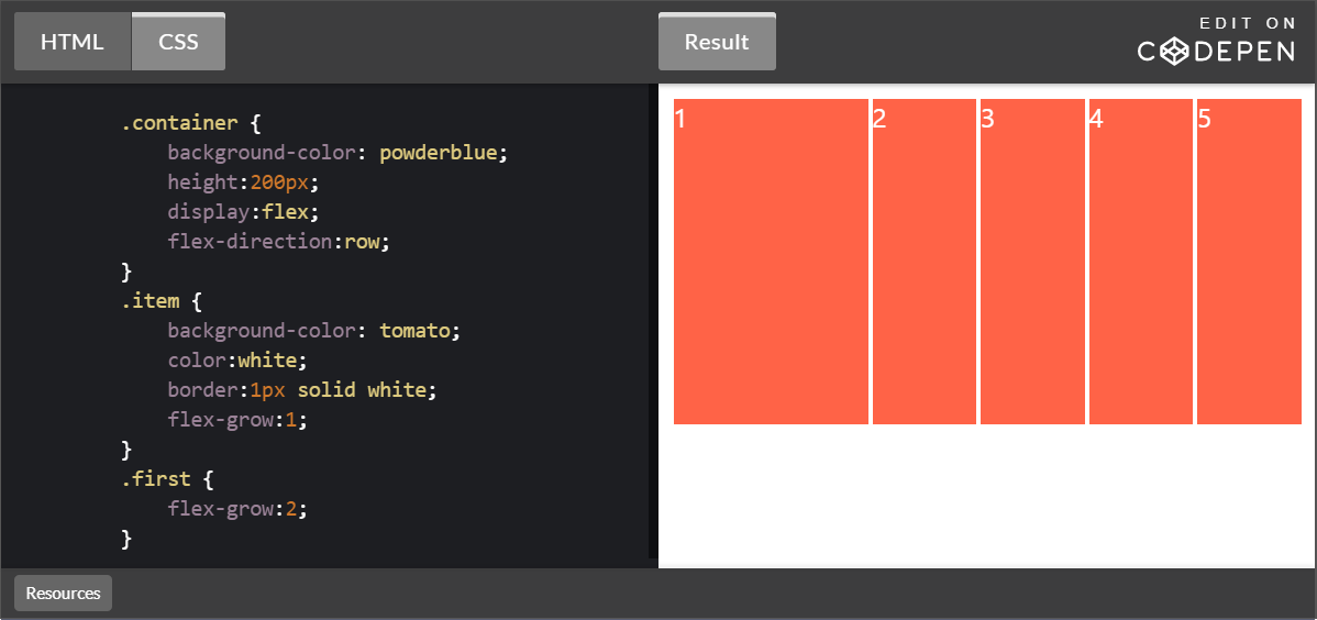
n/1에서 우선순위가 .first가 높아진다.
css
1
2
3
4
5
6
7
8
9
10
11
12
13
14
15
        .container {
            background-color: powderblue;
            height:200px;
            display:flex;
            flex-direction:row;
        }
        .item {
            background-color: tomato;
            color:white;
            border:1px solid white;
            flex-grow:1;
        }
        .first {
            flex-grow:2;
        }
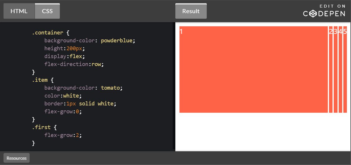
.item에 flex-grow:0;을 주게 되면 .first가 여백을 독식하게 된다. .first의 flex-grow값을 어떠한 것으로 바꿔도 여백을 독식한다.
css
1
2
3
4
5
6
7
8
9
10
11
12
13
14
15
        .container {
            background-color: powderblue;
            height:200px;
            display:flex;
            flex-direction:row;
        }
        .item {
            background-color: tomato;
            color:white;
            border:1px solid white;
            flex-grow:0;
        }
        .first {
            flex-grow:2;
        }
flex-shrink
설정된 숫자값에 따라 flex-container 요소 내부에서 flex-item 요소의 크기가 축소된다. flex-shrink: 0;일 때 는 element의 크기가 축소 되지 않는다.

- 참조 https://codepen.io/enxaneta/pen/adLPwv